

The Art of Brewing
 Story by:
Ale Sharpton
Story by:
Ale Sharpton
Hmmmm… Should I choose this Brooklyn Black Chocolate Stout, whose logo was designed by Milton Glaser, or instead go with North Coast Brewing Company’s Belgian-style abbey ale, Brother Thelonious, which sports a hand-painted portrait of its namesake jazz legend?
Of course this is far from the thought process that connoisseurs typically go through when selecting a beer, but these days one can’t help but notice how creative beer labels and packages have become. The passionate individuality of craft brewers is certainly on display when one takes a stroll down the aisles perusing the hundreds of various brands. While collectors of vintage breweriana turn their homes into mini museums, beer stores are becoming their own form of modern art galleries.
 One popular brand leading the wave of fine beer art is Unibroue. Revered worldwide for its premium bottle re-fermented ales that masterfully emulate the brewing tradition of Belgium, the Quebec-based brewery also goes to great lengths to ensure that the artwork on its bottles and packages is equally noteworthy. Asaf Mirza, Unibroue’s art director and designer, has been crafting the brewery’s eccentric packaging since 1991, when he created the artwork for the Belgian-style wheat ale, Blanche de Chambly. He said recently that the overall goal of his work is to simultaneously honor the history and legends of Quebec and to prepare the consumer for a rewarding drinking experience.
“Unibroue founder André Dion contacted me through the Yellow Pages. We both live in this small village of Chambly, and that’s where the whole thing started,” Mirza remembered. “He said that he was bringing an ale from Europe that will be the first in North America which is a bottle re-fermented, traditional European abbey-style ale. He also mentioned the complex brewing process was really an art and that is when it really hit me. I think when you drink alcohol you become self-absorbed, discover yourself, open up, become creative, sensitive, you smile, imagine and think… you are in a different world.
“When you open the beer, you pour it, look at it, smell and taste it,” Mirza continued. “I didn’t want people to throw the bottle to the side. The bottle should be an art and decorative piece on the table for them to look, enjoy and cherish as well.”
Instead of falling back on the “it’s like picking my favorite child” reply when asked to name his favorite Unibroue label, Mirza had no problem admitting that one label stands out among them all – Maudite, the strong dark ale with a red-hued label depicting a canoe full of men in winter garb frantically paddling above a smiling image of the devil.
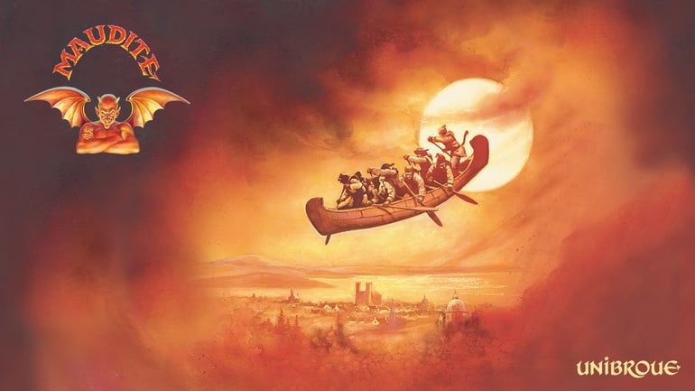 With Maudite, which translates as “cursed,” Mirza noted that, “The layout is very unique, with such a fiery background and the devil at the bottom. This is a very strange ale, and I like the devilish color, yet it is full of power, gold and fire. I try to relate my art to the taste and even the aroma of all of the beers.” The scene emblazoned on Maudite depicts the old tale of La Chasse-Galerie, or the Flying Canoe – a story about a group of homesick lumberjacks who risk losing their souls to Satan by having him float them home across the moonlit sky in their canoe to see to their beloved on New Year’s Eve. Mirza pairs the legend with the potent amber ale’s heavy malt and wintery, warming cognac qualities.
Besides serving as the model for the devil on the Maudite illustration, which, Mirza admitted, “has a bit of my resemblance,” the artist’s hands-on contributions to Unibroue’s designs are literally that: he hand-letters all of the names of the beers. His only help comes from two venerated painters, Charles Vinh and Zigmond Pifko, who follow Mirza’s meticulous direction for the color schemes of the labels.
Another artistically inclined brewery is the Athens, Ga.-based Terrapin Beer Company. Terrapin’s founder and brewmaster, Bruce Buckowski, who goes by Spike, recently recounted the day he scored a partnership with Richard Biffle, the world renowned artist who has designed albums and merchandise for some of the most celebrated musicians to ever take the stage, including Carlos Santana and the Grateful Dead. “I met Richard at a large outdoor music festival called Bonnaroo in Tennessee,” Buckowski said. “I walked into his makeshift studio he had set up there and noticed that I had much of his art in the form of Grateful Dead albums and concert posters. When I asked him to do art for a beer company called Terrapin, he jumped at the chance.”
 The result? Brilliantly colorful artwork that uses a smiling turtle to illustrate the style and name of the various brews. For instance, for the brewery’s high gravity Monster Beer Tour series, their mascot can be seen donning a chef’s hat while sipping an overflowing brew and baking a sheet of cookies (Coffee Oatmeal Imperial Stout, 8.1 percent ABV), as well as sporting a white Albert Einstein-like hairdo and a lab coat while surrounded by glowing green rays of electricity (Rye Squared Imperial Pale Ale, 8.5 percent ABV). The art is intricate and complex, but the actual method of conceptualizing it turns out to be quite simple. “We usually send the name of the beer and describe what it will taste like, and [Biffle] will do the rest,” Buckowski said. Biffle “will send us a sketch and we will add our ideas or just let him finish the art,” he added. “We don’t give him too much direction, and it works out just fine.”
Teamed with Chris Pinkerton, a graphic artist who has also made his mark on the music industry by working on projects for the Rolling Stones, Guns & Roses, Phish and Pink Floyd, Biffle has done a remarkable job drawing attention to Terrapin, which launched in 2002. Terrapin has also collaborated twice since last year with the Left Hand Brewing Company out of Longmont, Colo., creating an imperial black lager called Terra-Rye’Zd and an espresso milk stout known as Depth Charge for its Midnight Project series.
Speaking of collaborations, this fall Northern California’s Sierra Nevada Brewing Company joined forces with Dogfish Head, Delaware’s craft beer powerhouse, to create two high- and low-gravity brews, dubbed Life & Limb and Limb & Life respectively. The Limb & Life beer is available only on draft, but Life & Limb, which weighs in at 10 percent ABV and is brewed with real maple syrup from Massachusetts and barley from northwest California, has turned heads with its label’s design. Jeremy Holmes, an artist famous for his multi-dimensional, collage-style illustrations, chose to create a picturesque scene for the Life & Limb label that depicts a serene, natural setting of mountains, birds and trees colored in earth tones. Holmes captures the natural aesthetics of the breweries’ East- and West–coast settings, and also gives a nod to the hobbies of both brewers.
“Working on a collaboration beer was a new and exciting process,” Bill Manley, Sierra Nevada’s communications coordinator, explained. “The thing about collaboration beers, though, is they can be a bit tricky. Label requirements and distribution laws can get pretty complicated, especially with a nationally distributed beer. We decided to forgo either brewery’s traditional style of packaging and go in a different direction. We were admiring the artwork of artist and designer Jeremy Holmes and looked to him for some unique custom label art for the beer. The idea was Life & Limb, so naturally the tree was a great fit. In the branches, Holmes added little tricks and hidden treats that reference both Ken and Sam’s breweries and sordid pasts,” Manley said, referring of course to Ken Grossman, the co-founder and president of Sierra Nevada, and Sam Calagione, the founder and president of Dogfish Head.
 From the prominent tree in the label’s center to the background scene, there are many small details on the label that only the most discerning beer drinkers would understand. “The two prominent birds,” Manley noted, “are the California State bird, the Valley Quail, and the Delaware state bird, the Blue Hen Chicken. The tree includes a bicycle sprocket for Ken’s love of riding and a guitar as a reference to Sam’s on-again, off-again beer geek hip-hop group, the Pain Relievaz. In the mountains there is also a small climber for Ken’s mountainous past, a small Dogfish Head logo and the Sierra Nevada banner.” With only 3,000 cases of this limited-edition ale available, the Life & Limb bottle should become a keepsake among art-loving beer enthusiasts.
Shmaltz Brewing Company, which is based in San Francisco and has its beer brewed under contract in Saratoga Springs, N.Y., is also known for its label art. Its Coney Island Craft Lagers collection is covered with images of the stars of the Coney Island Circus Sideshow from the famed amusement park in Brooklyn, N.Y., including Heather Holliday, the Sword Swallower, and Donny Vomit, the Human Blockhead and M.C. of the show. The colorful images were created by the well-known artist Dave Wallin and Matt Polacheck, Shmaltz’s art director, who also does the artwork for the company’s He’Brew line of beers.
“As you can imagine, designing labels for Shmaltz Brewing Company is an insanely creative and fulfilling job,” Polacheck said. “The process of coming up with the names, beer styles and initial concepts is a collaborative effort between me and Jeremy Cowan,” Shmaltz’s owner. “Once those things are established,” he continued, “my goal is to create a label that stands out and causes people to take a second and third look. Our beers are created using complex, unique brewing techniques that demand complex designs with many layers of imagery and meaning that tell our unique stories. We want to give the consumer a complete experience so they can enjoy what’s on the outside of the bottle as much as what’s inside the bottle.”
Shmaltz’s artwork can be somewhat shocking, but when asked how far he is willing to take it, Polacheck noted, “I have to submit all the labels to the government for approval, so I keep that in mind when designing the artwork. That’s not to say I don’t push the boundaries.” He added that Shmaltz’s “version of the Clydesdale horse” is either the He’Brew logo’s beer-raising rabbi or the “tattooed freak face” on the Coney Island bottles.
 The Clydesdale that Polacheck refers to is of course synonymous with Budweiser by Anheuser-Busch InBev, and even that mega-brewer tries to be a bit creative now and then when it comes to label and packaging design, though, as one would expect, its labels are typically more conservative than those from small breweries. Still, Nate Scudieri, the brand manager for Michelob, explained that they “don’t have stringent rules to follow.
“Inspiration for a package design can come from many places,” Scudieri said of the process. “We watch color trends and pay attention to what is going on in many other industries like fashion, electronics, digital, automotive and other food and beverage categories. For a new label or packaging, we determine what is or isn’t working with the current look and search for a design that is the right fit for the beer style, brand and adult consumer. We conduct research with consumers to make sure we are on target and not creating any confusion. The goal is to develop a design that communicates the beer’s attributes clearly, while still feeling familiar and recognizable to our consumers.”
Recently Michelob, whose brewing tradition dates to 1896, used a mohawked orange slice wearing sunglasses to represent its Shock Top Belgian White beer in an attempt to reach a younger audience. Shock Top “has the same general look, label shape and bottle as the other Michelob Brewing Company beers, but with a twist,” Scudieri explained. “The beer was originally introduced as a spring seasonal under the name Spring Heat Spiced Wheat. Its label design was similar to the graphics, characters and brand names seen on our seasonal beers like Jack’s Pumpkin Spice Ale and Hop Hound Amber Wheat. The initial response to Spring Heat Spiced Wheat was tremendous. When we introduced the beer year-round under the Shock Top name with a new label, we wanted to ensure it maintained a design style that its fans would recognize.”
Such exacting market research stands in stark contrast to the approach small breweries often take in designing their labels and packaging. “I think that others probably overanalyze everything that they do so it just becomes sterile,” Terrapin’s Buckowski said. “We pretty much fly by the seats of our pants and see what happens.”
Storeowners who specialize in craft beer, like Kraig Torres from Atlanta’s Hop City and Rich Carley of the Charleston Beer Exchange in South Carolina, offer another window in to the ways that brew art impacts consumers.
“As a beer retailer, I see a clear correlation between packaging and sales,” Torres said. “Brands like Rogue, Coney Island and Magic Hat are smart to create eye-catching bottles and six-pack art. It often leads to a first-time purchase, which translates to repeat purchases when the beer tastes as good as the marketing.”
“People love the art,” Carley added. “Sometimes a guy would come in with his girlfriend or whatever and she would see something like the Sword Swallower for Coney Island and buy it. With the Terrapin Wake-n-Bake, that one is really popular, too. Founders is also an admired brand regarding artwork. People certainly respond to the labels a lot – along with the actual names of the beer – and I think they make purchases sometimes solely because of that.”
Thanks to the vivid creativity of breweries, whose bottles and packages do everything from honor the legends of their homelands to provide eye-popping images of freakish carnies, the artwork of the beer world may soon start to garner the same admiration as the very ales and lagers it aims to portray.


Comments 0
No Readers' Pick yet.