



What Makes a Craft Beer Label Stop You Mid-Aisle
 Story by:
Beverages Blog
Story by:
Beverages Blog
A craft beer label designed correctly will draw consumer attention during the often-sizeable process of making a selection from dozens, if not hundreds, of choices. This visual Appeal is created through careful design and the commitment of a brewery to the expression of its distinctiveness. Even if it’s the space set up at the taproom or the way the beer is displayed, it can impact the brewpub experience and what they’ll remember. A design that complements the personality of the product, rather than distracting from it, can be a part of the experience as well.
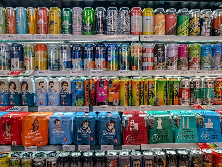
The elements on the label are selected to spark curiosity and brand values in mere moments. Bustling beer shelves make it more important than ever that breweries make sure their labels are noticed. The most memorable labels will invite you in and set your expectations for the beer you’re about to enjoy by design, color, and story. When viewing the can/bottle, the artwork, theme, and message make a statement and compel viewers to learn more. Many customers may need an “aha!” moment to decide whether to go with a tried-and-true or venture into new food.
The Power of First Impressions: Visual Cues that Invite Attention
A split-second decision is often made based on the visuals of labels when consumers are shopping in the beer section. Packaging design plays a major role in shaping that first impression. Colors that are bold will appear fresh or exciting, while earthy colors will appear traditional and crafty. The style is all about the right font; the sleek sans-serif font is more of a modern and trendy font, while a hand-lettered font can add an artisanal and small-batch look to a trending design. Imagery is also important; drawings, mascot logos, and even simple geometric graphics help grab attention and offer hints about what makes a brewery special.
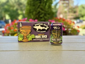
Consider adding creative or innovative visual comparisons or images to create a label that really pops. For example, for those who like one of the fun and light beers, the can with a cute design of an animal might be easier to see than a can with a minimalist and plain design that would resonate with those who prefer a more sophisticated beer. These sorts of signals help a beer obtain its turn to “see” in a competitive bottle store prior to the beer has time to read a word.
Collaboration and Consistency: The Role of Design Partners
Many standout labels are born from close collaborations between breweries and design specialists. Creative agencies help breweries translate their brand ethos into instantly recognizable shelf appeal. For instance, beer branding by Helms Workshop offers integrated solutions to guide brewers in creating packaging and a visual identity. The partnerships ensure consistency with the brand while, at the same time, providing each beer with a narrative.
A successful partnership means that the designer understands the brewery’s goals and can go with the flow of new events or seasonal releases without deviating from the initial brand. This implies that even if the artwork or colour schemes of the special edition are different from the original, the consumer will be capable of identifying the brand. This way, you can prevent design clashes or additional confusion caused by different common variations in the design, resulting in a family look for the entire product line that fosters recognition and trust.
How Storytelling and Identity are Woven into Label Design
Beyond aesthetics, successful craft beer labels carry a brewery’s story and culture through branding design. The colour of each of these images must relate to the values and history that the brewery wants to send across, as should each of the small icon images. Any town or city landmark, map or regional saying could serve as the motif for a label in a brewery in a local brewery that wants to feel “local” without compromising on quality. Some materials and finishes, e.g., textured papers, metallic foil, and matte finishes, make the label feel like a special gift in the hand.
There will be, in many instances, a clever beer name, an ingenious beer description, or a visual pun for the beer. Having recycled content, sustainable colour schemes, or talking about the environment on the label are ways for sustainability-mission brands to highlight their commitment to sustainability. Some appeal to humor, others to nostalgia, others to adventure, to make an impact on the audience they are intended for. The stories on these beer labels create a sense of anticipation before the drink is even taken and give the drinker a sense of what the brewery is like, the inspiration behind their brews, and their approach to brewing.
Examples of Labels that Leave a Lasting Impression
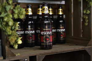
Some breweries are well-known for labels that last long in your mind after the last pour. For instance, using regional folklore and mythical creatures or animals such as local wildlife for custom illustrations. Incorporating local artists’ work, or providing a matte finish or a glow-in-the-dark effect, could provide tactile or visual inspiration that encourages the can/bottle to be picked up by the shopper. From funny quips on the side to custom artwork, a reinterpretation of the brewery name, or even a collaboration with a band or arts group, there’s no shortage of ideas to catch the shopper’s attention in the middle of the aisle.
These touches are thoughtful, creative, and detail-oriented; they draw in visitors not only for the taste of the drink they’re enjoying but for the opportunity to become a part of a brand’s story. Finally, the best beer labels are designed with care, and every aspect of the label – from colour palette to paper choice is intentionally selected to make the first impression and the lasting impression. If the visual attributes seem to be a part of the beer itself and the brewery, then the label is not a separate entity, and it is not an afterthought.


Conversations (0)
No comments yet.