Start 14-Day Trial Subscription
*No credit card required

Cascade Brewing Rebrand Wins AMA MAX Award
Portland, Oregon's Cascade Brewing, which underwent a recent rebranding effort in conjunction with Murmur Creative, was awarded an AMA MAX award for the subtle and elegant designs on its bottles. Here is the full release from Cascade:
PORTLAND, Ore. – Feb. 12, 2018 – Cascade Brewing’s rebranding efforts were rewarded this week as Portland design firm Murmur Creative received the MAX Award for branding on behalf of its work with the brewery; the award was presented at the 2018 AMA MAX Awards Ceremony, held on Feb. 7 at Revolution Hall.
The AMA MAX Awards honor the work of the eclectic mix of marketers, creatives, freelancers, entrepreneurs, strategists and innovators in the Pacific Northwest. Murmur was specifically awarded for creating work that reflects the direction and intent of an intelligent business strategy.
“Cascade creates artisanal beers and they needed a new logo and packaging to truly showcase that level of quality,” explained Andrew Bolton, Murmur Creative Director. “Their logo also needed to reflect their place in Portland’s rich craft brewing history and their packaging had to help customers to visually distinguish between their three tiers of sour beer while maintaining clear brand aesthetics.”
According to Tim Larrance, V.P. of Marketing and Sales for Cascade Brewing, “When we first set out on this journey for a new brand and identity, we were pretty well set on what we wanted with regard to a particular look and feel. But after just a few meetings with the Murmur team, they opened our eyes to a whole new direction. After seeing their concepts, we completely ditched our previous ideas and let Murmur take control and guide us to where we need to go.”
Murmur set out to create a new brand aesthetic that felt both accessible and high end. The final design referenced the beer crafting process in the new branding and also created packaging that positioned the brand for less customer confusion and better sales.
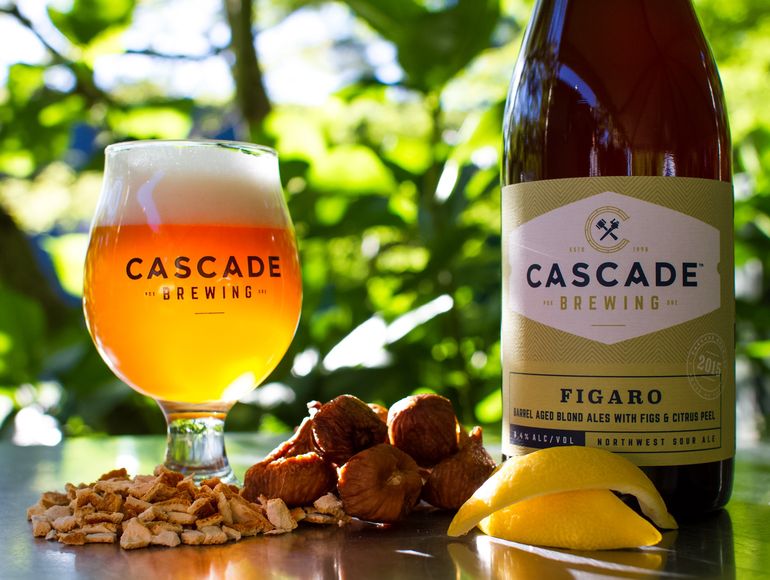
The new logo featured the top view of a barrel in the shape of a C, paying homage to the brewery’s barrel aging process. A hammer and spigot was added, representing the tools used to tap the barrels, while also lending a playful nod to Cascade’s revolutionary influence on Portland’s beer scene. The “A” in Cascade was designed to mimic the nearby mountains in the Cascade Range, from which the brewery gets its name.
In addition to the logo, Murmur Creative designed three distinct label formats, one for each of the three tiers of products the brewery produces. The three tiers are based on the ingredients used in the beer, the time the beer is aged in the barrel, and the type of barrel used – all of which establish the pricing tier of the project. Each beer within each tier features its own color to delineate between brands; overall, the three tiers use the new branding to position for three slightly different markets.
The highest tier label showcases a woodcut inspired design with illustrated flourishes and stamped foil to communicate value. The second tier label features a watermark background and the third tier is rendered in brighter colors to highlight their accessibility.
“The logo and packaging work together to create an overall high end brand that evokes the craft and history of Portland beer,” explained Murmur Creative Director Andrew Bolton. “The impression is one of regional history, artistry, and uncompromising craft. It’s Cascade in a bottle.”
Larrance was impressed not only with the end product, but also the communication along the way. “The constant discussion on the fine tuning of this project worked really well to come to a final brand idea in a timely manner. From start to finish it was just over six months, which was half the time we were expecting.”
This rebrand project, which debuted one year ago, was one of the most important undertakings that Cascade has ever been a part of. “Cascade has a worldwide following, and many people know us by the old labels and logo; change can be hard for some people,” noted Larrance. “But in the end, we have seen an overwhelmingly positive response to our rebrand; I would say that 99 percent of the feedback we get is very favorable.”


