Start 14-Day Trial Subscription
*No credit card required

Starr Hill Reveals New Packaging Design
04/27/2015
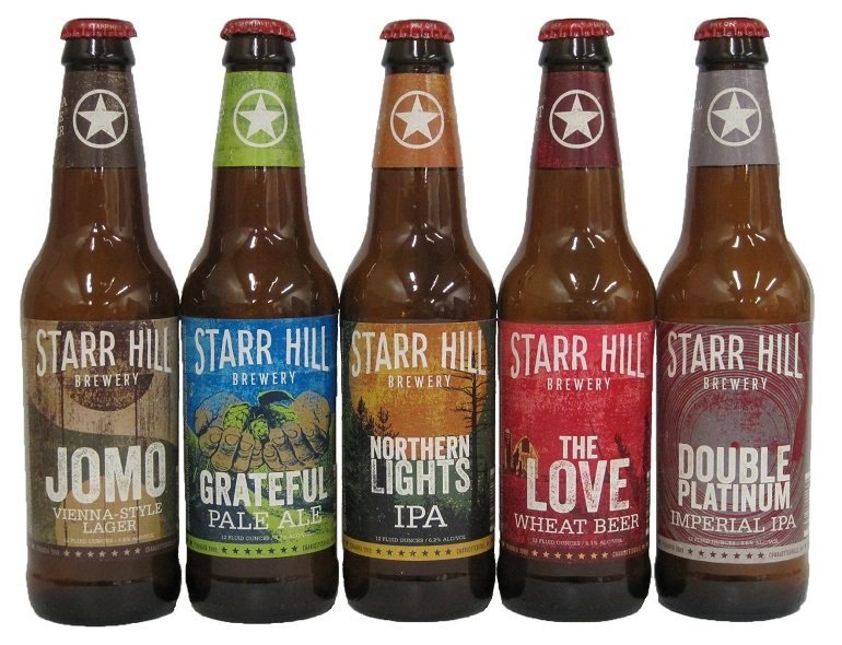
Starr Hill Brewery has rolled out new label artwork and new packaging designs after its redsigned logo was introduced in March. Clean, bold logos and eye-catching artwork are a huge part of a beer's shelf appeal. This redesign helps Starr Hill modernize and update its venerable brand.
Here is the release from Starr Hill:
Starr Hill Brewery is raising the curtain on new packaging artwork for their year-round lineup of beers following the release of a redesigned logo in March.
The refresh celebrates Starr Hill's 16-year evolution from a small, niche-focused brand to a regional craft brewery with a wide audience, while remaining true to its humble roots of bringing people together through great beer.
"The new labels bring the outside of the bottle in line with what's on the inside," said Jack Goodall, Starr Hill's Marketing Manager. "For the past six months we've had tremendous participation and feedback from both long-time supporters and those new to our brand, in addition to the entire Starr Hill team. Now we're thrilled to share them with all Starr Hill fans throughout our distribution footprint."
The landscape of Central Virginia and the brewery's roots in music provides inspiration for the imagery. Textures and graphics on the packaging take cues from silkscreen concert posters. The bright, but simple color palettes give each brand its unique character.
"The identity's stripped down, handcrafted typography and imagery form the foundation of a consistent visual brand while retaining the brewery's iconic star logo," said Wyndsor Hug, Creative Director at Charlottesville-based Storyware. "The star has been the hallmark of the brand since the beginning and is the only remaining visual element."
The new packaging will make its debut on shelves this July. August will see the release of the first seasonal brand with redesigned artwork, Boxcarr Pumpkin Porter, as well as the Fall Tour Variety Pack.


