Start 14-Day Trial Subscription
*No credit card required


Devils Backbone Brewing Co. Debuts Brand Refresh
September 19, 2018
 Devils Backbone Brewing Co. out of Roseland, Virginia has unveiled a streamlined logo and new packaging for its beers that focus on "enjoying simple pleasures."
The new logo and packaging represents the brewery's "friendly, approachable, and outdoorsy personality," according to a release and is timed in order to celebrate the brewery's 10th anniversary.
The full release from Devils Backbone is below.
OVERVIEW
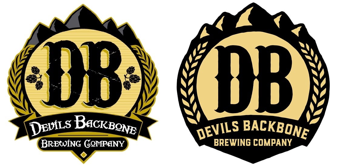
- Logo: Devils Backbone has had the same logo since brewing its first beer 10 years ago. Starting with a strategic position of “enjoying simple pleasures,” the aim was to streamline the logo and modernize it to complement the simplicity of the new packaging. And make it more noticeable from across a dimly lit room, amongst a sea of other brands, shining like a beacon in the competitive craft beer market.
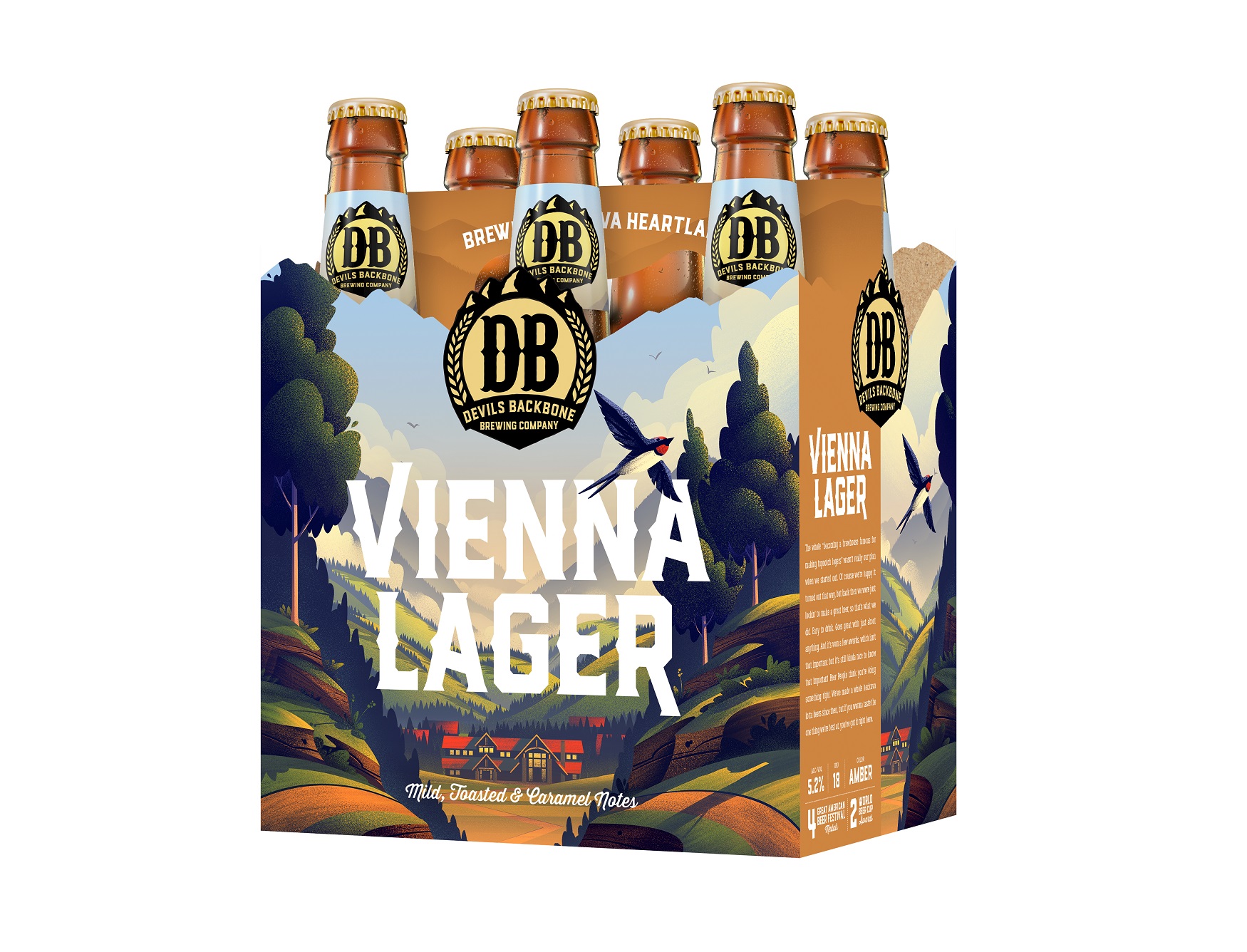
- Aesthetic: The look and feel of the packaging refresh is based on a “modern travel poster” with illustrations featuring Virginia outdoor and landscape scenes. The look is rooted in tradition, with a modern twist, just like Devils Backbone strives to achieve with its beer. To achieve this, Devils Backbone enlisted the expertise of Charlottesville-based design agency Okay Yellow and two different, renowned illustrators:
- Brian Miller - Award-winning Colorado-based illustrator who done work for REI, Weber Grills, and Adobe
- David Moore - Veteran illustrator of over 25 years. From Canada, he is inspired by 1930’s and 1940’s posters and has done work for HALO ice cream, Disney and the New York Times
- Illustrations: The team created packaging that invites the consumer to step inside snapshots of Virginia locations and stories, a beautiful view that wraps around all sides of the package to engage the consumer. Casual, conversational beer descriptions capture the new personality of Devils Backbone, a good neighbor who you wouldn’t mind sharing a beer with. Fun tidbits of Virginia culture and lore can be found on the bottom for the adventurous, while a map guides you to Devils Backbone’s two locations. Virginia’s Blue Ridge mountains grace the top of every package as the thread that weaves them all together, and reminds us that these beers were crafted in the heart of Virginia. The result is a powerful and memorable portrayal of Devils Backbone’s culture and foundation on which the brand is built.
- Packaging Design: Developed by Devils Backbone’s long time design agency Okay Yellow in partnership with Familiar Creatures, every aspect of the package design has a particular purpose and intention, including:
- Each bottle pack features a custom die cut reflecting the landscape of the Appalachian Mountains--which are right in Devils Backbone’s backyard!
- Stylized beer names and styles are now more prominent on each package.
- Color coded crowns and sidebars with copy that reflects the brand’s personality and tells the story of Virginia.
- Custom bottom panels for each beer with fun facts.
- Looking Ahead - Brand identity: Simplifying the new aesthetic is just the first step of Devils Backbone’s new marketing campaign launching in 2019: “Slow by Nature.”
- Slow by Nature exemplifies how Devils Backbone takes its time making lagers in the Virginia Heartland--a place nestled in the Blue Ridge mountains away from the hustle and bustle of life.
- Lagers aren’t hastily made and take much longer to brew than other craft beers. DB takes pride in being a lager-first brewery.
- It also is an implicit call to action--or rather, less action--to get outside, and be immersed in the simple pleasures of nature.